Today Thorpe Park went in a bold new direction with the announcement of their brand new Thorpe Park logo!
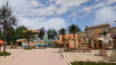
Next year is a big year for Thorpe Park as Hyperia will become the UK’s tallest and faster roller coaster opening next year along with a new vibrant land for all the family as Big Easy Boulevard brings a New Orleans vibe to what was once Angry Birds Land.
A bold direction for the park needs a new bold image and the new logo released by the park has certainly divided fans unlike anything I’ve seen before.
Simplistic in its design Thorpe have gone with a logo they label as colourful and vibrant yet the font of the logo has no symbols or anything that describes that but they have created various colourful background images and concept art that add context to the logo and its placements.

The log is described as:
A fusion of our rich heritage and a vibrant spectrum of colours that vividly embodies our vision.
On first inspection I have to disagree with the statement entirely but seeing it on the concept Hyperia poster had me excited, it looks genuinely phenomenal but I think that’s because the Hyperia concept poster looks so brilliant.
No sugar coating or corporate jargon was the way forward for the park but I feel as though the logo doesn’t seem to represent a theme park and now up against current Merlin attractions logos it’s by far the weakest and doesn’t stand out whatsoever.
It’s taken a very simplistic route where it’s just simple font and nothing more, no symbols no thrill seeking representation it’s just very colourful on a background that is changing colour but on the website in the header it looks lost.
![]()
Reminiscent of a holiday camp or a brand of bargain sportswear it really isn’t blowing me away early doors.
I hope that over time the logo grows on me, the park is doing so much right and has been the stand out theme park for me in 2023 but this logo doesn’t scream a big, bold exciting future and that saddens me.
A bold move from the park that certainly takes guts, but will this move pay off?
Find out more about the logo choice straight from the park themselves HERE
What do you think of the brand new Thorpe Park logo?